
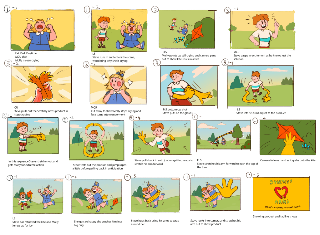
Here is my colour script guide based on my storyboard.
I wanted the beginning to be more dramatic so i made the colours more intense and i took away the blue from the sky, so there is a clearer sense of problem in scenes 1 and 2 as compared to when Steve brings out his gloves from scene 3 onward which brings the solution. The colours are still vibrant but less intense and have more blue to give a sense of calmness and happiness/Joy until the end which shows the credits to the product colour scheme

I got some feedback from Karen to change the way my background looked, she mentioned that there was not enough shape harmony in my background design, so I changed my trees and shrubs from a very organic messy style to a more geometric round style to suit the shapes of my characters. I feel that it looks much better than the previous design as there is more depth in the frame and i find it easier for my eyes to move around the frame

I was also tasked to make a “set design pack” to include more exploration on the placements of shrubs and greenery in my background. I made a layout map of my environment setting as my location is taking place outside instead of an indoor setting. I also included a lighting guide for exploring what time of the day i want my story to take place
