Mood board made for colour schemes and for over look and feel inspiration
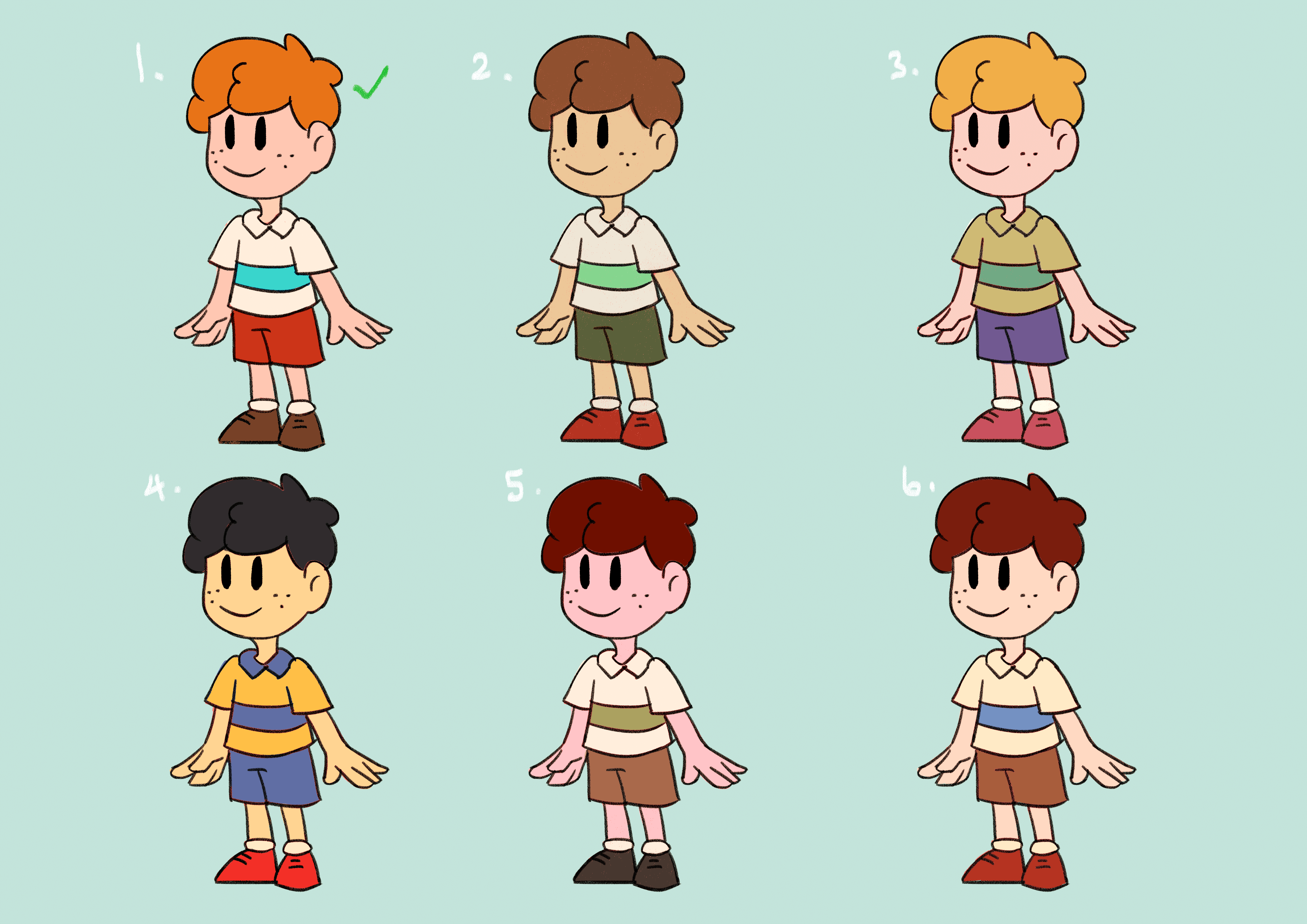
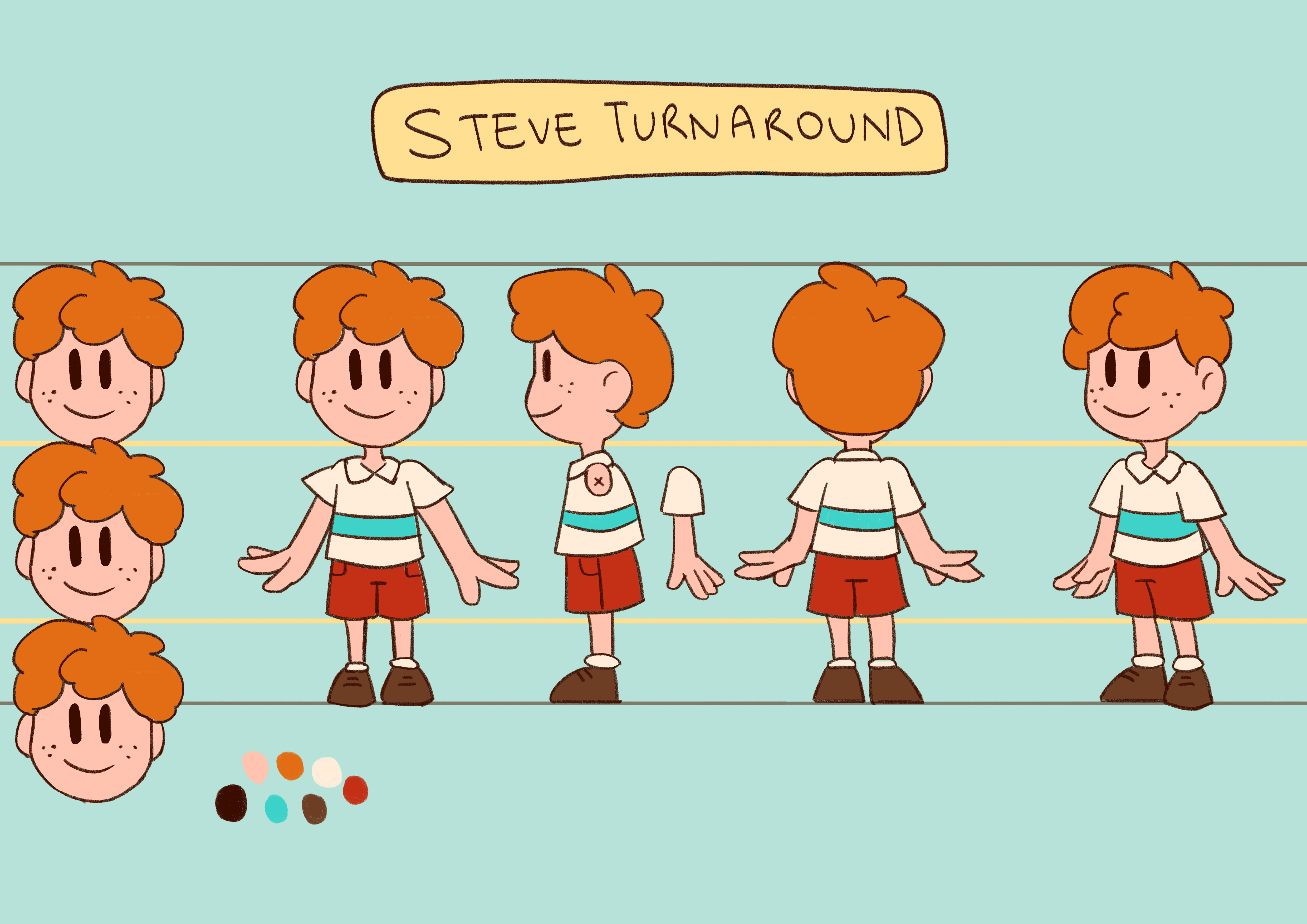
I went to go make a character mood board for my colour references, I made 6 different versions of Steve and decided to go for the first colour scheme after tweaking it a little more. I used more warm orange-reds on him as reds tend to represent the heroes and protagonists most of the time. He looks more bright and cheery which suits his optimistic, brave and charismatic personality.
Steve’s Colour SchemesSteve’s Turnaround
I then proceeded to do Molly’s colour scheme. I had to make sure their colours complemented each other and their personalities. Molly could not stand out more than Steve as he was my main character, and Molly has a more reserved naïve personality. I also referred to my mood board for colour reference
I wanted Molly to be the same age as Steve but someone who came from a different background and grew up a bit differently. For her character design I wanted to make her a big overgrown girl who looks strong so that she can give Steve a crushing hug in the ending of the TVC. I first imagined her looking more brute and dumb
Yes this was my first draft of Molly and I thought of someone kind of dumb and messy looking like the cooties boy from Powerpuff Girls but not as gross and threatening
Molly sketches
This is an improved layout of Molly’s character design
I decided to explore different variations of how i could draw Molly, using different styles and clothing. I wanted her to look cute but also like someone who doesn’t socialize much and doesn’t know much about the world. She’s someone who is home schooled and doesn’t go out much, so one day she crafts her own kite to play with in the park but the kite gets stuck in the tree when a huge gush of wind blows it out of her grasp, which is when Steve comes in with his problem solving product and they become friends in the end
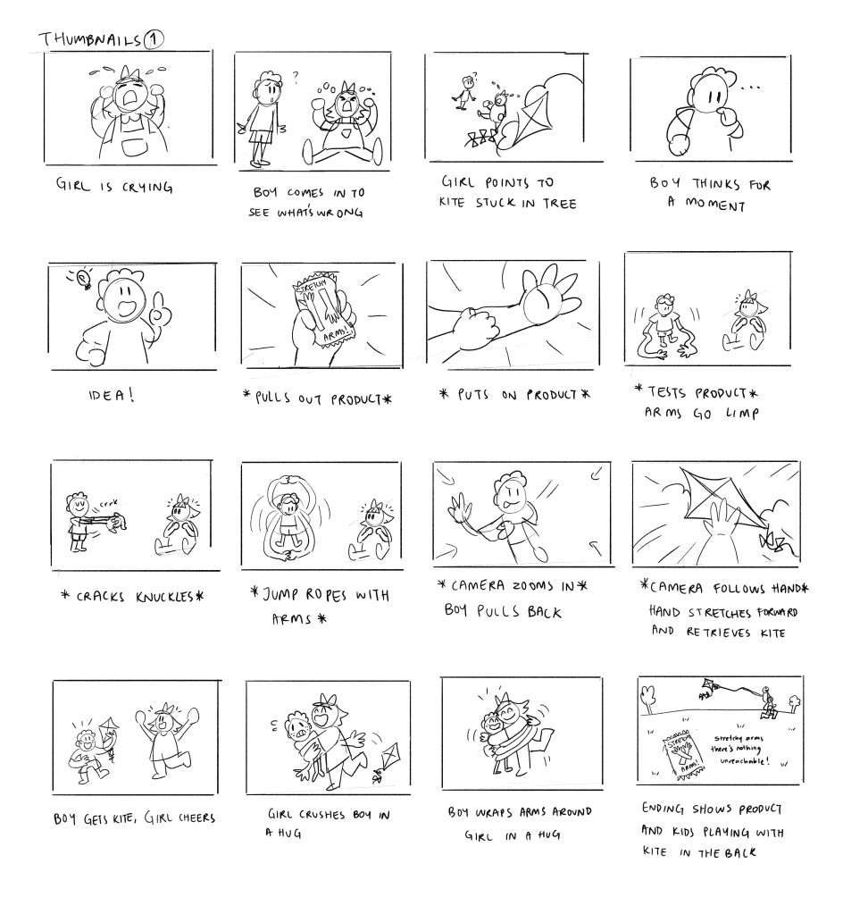
Here is an updated version of my storyboards, i made some changes to the shots but the story is still the same
I had consulted with our Lecturer Alan and he liked the idea of possibly having the ‘S’ shaped arms interact with the other letters, tickling them or pulling them and such. The idea made me think of the title intro for Monsters Inc.
Out of the 3 storyboards i like the first one, because it has a distinct stretchy and elastic look to it that reminds me of more of old cartoon idents and that bad quality stretchy 3D animation
My first initial idea was to show a family that all have their own “Stretchy Arms” gloves and using the gloves in heir own ways,creating a fun chaotic scene in the house. However, the idea was scraped completely as it included to many characters to design 😦
So I tried to think of others ways to show one main character having fun with his gloves,I had to think of a way to show at least 3 ways to use the gloves in a fun and useful way.
First thumbnail ideas based on a combination of ideas 2 and 3
Here are some references for commercial inspiration
I took some reference from 90s kids toys tv commercials
I thought of this commercial for the actions and the way the ad delivers the product, I liked the problem solving aspect of the story
A good reference for elastic jump rope arm animation 😀
I wanted my main character to be a friendly little 9 year old boy, he is going to be showcasing my product and using the gloves. With that in mind I had to think about making the hands and arms the focus of my character. After drafting the first 5 designs i asked for some input from classmates and consulted the teacher(Karen) Most seemed to love the appeal of the 3rd design so I tried to improve him by giving him shorter legs and more noticeable arms
Thinking about making a character with expressive limbs made me think of Dee Dee from Dexter’s Laboratory. She has incredibly long limbs and a tiny body as her character is a very expressive and destructive character that dances a lot and breaks a lot of things
Please feel free to give some input on which design elements are your favourites!
Here’s an update of sketches i made for my product! I tried to think of what elements i wanted to include, what kind of fonts I wanted,the colour scheme and what kind of brand I’m trying to sell.
Logo/Ident has to be animated in After Effects
Green, yellow Red(inspired by gummy candies)
Simple rounded,childish looking font
Fluid and stretchy animation
I am still thinking about how to animate the ident and whether i should include a mascot, that could either represent the product or audience. Perhaps do i show a little boy hugging himself using the gloves?
Much to think about, Id definitely want to feature the gloves themselves and I might want to work with Vectors from Illustrator and animate on After Effects
Video about animating with Vectors
I found this video while i was looking for some inspiration and i would love to try out this technique!
I have decided to go with my “Stretchy Arms” idea and decided to look for more reference and inspiration for colour schemes, art style and idea development
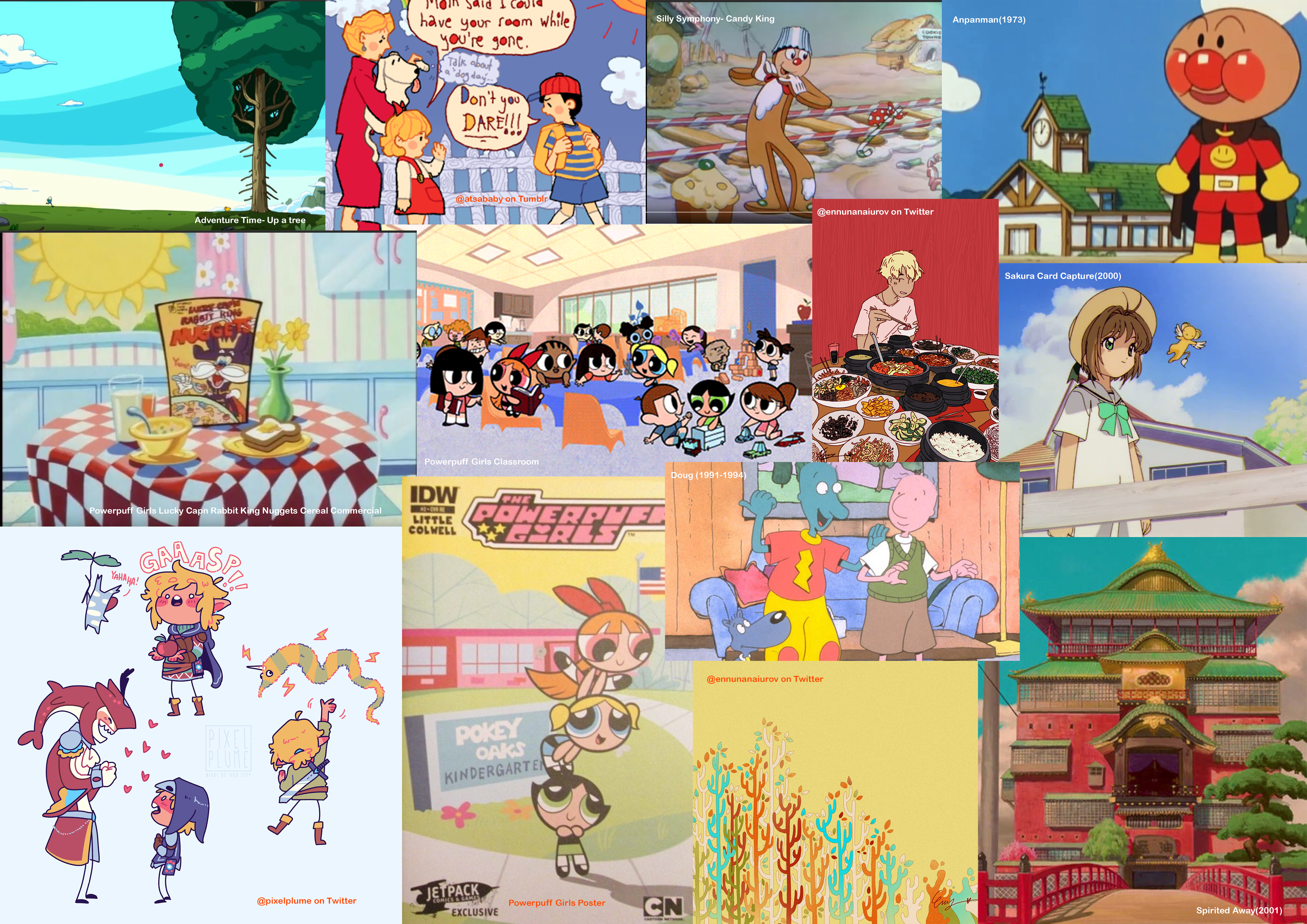
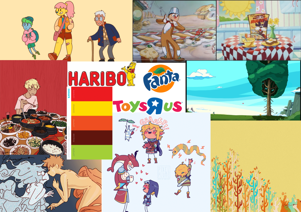
Here’s a collage of my references! I have included art from some twitter artists, video reference screen caps and some famous brand logos i got inspired for my product
References with reasoning
I have included my reasoning for picking my references and what i like from each work, i will probably try to look out for more animation inspiration later on and drop some links for more referencing.
If anyone knows any good animations with very fluid/bouncy/stretchy motions with a childish feel/colourful look to it, do let me know in the comments please! All suggestions are welcome 🙂
What is my thought process? The first thing that comes to mind is the kind of feel or vibe i want my animation to have. The first thing that came to mind was something colourful, with and innocent or childish vibe. Therefore my product would be better suited for kids or families.
So this was my first artist reference for the style i want to go for. It is colourful and childish, i want to make a product that’s fun for kids and inspired by the concept of childhood, as nostalgia is a big part of my art.
Lucky Captain Rabbit King Nuggets Cereal Commercial from Power puff Girls
The first type of commercial that came to mind was cereal commercials. I used to love them as a kid and remembered this scene in Power puff Girls.
I like the landscape in this scene, the open fields and i like the simple idea of a kid getting something stuck in a tree and needing to retrieve it. So I thought of making a product that would be fun and useful for a kid in that aspect.
First Ideas
This is a collection of first drafts of product ideas made from mind maps, so the sketches are very rough and simple just to convey my idea and thought process before furthering and design.
My first initial idea was to create something fun and useful for kids as a target audience, this idea would be ideal to use for animation as the product includes a lot of elasticity, which means more opportunity for squash and stretch For this idea i can still use my first initial art style i had hoped to use but would change the colour palette to have more cool tones especially blues,purples and some yellows. I thought it would be nice to have a product that can appeal to those who have lost a loved one, I also love working with the concept of ghosts and the dead as i have worked previously with making stories and universes based on them.I had asked some people for their their take on what an ideal product would be if they could have anything, and most want something that helps with transport and mobility, so i decided to create a product that would be very useful for disabled people or the elderly who have trouble moving a lot. To make the animation more appealing to the eyes and not so boring i would probably showcase an elderly doing crazy stunts to add some humour value to the commercial.
For our project this semester we have to make a TVC commercial advertising an imaginary item.Think about anything you could ever want! The item we are trying to advertise should be appealing to a specific audience. We are tasked with making a 30 second animated advertisement, make a company logo animation and design a poster as well.
This blog is dedicated to my process of coming up with ideas and sketches as well as showcasing where i draw my inspiration from